
During my time poking around on the internal development forum, I came across a bunch of screenshots from earlier builds, sometimes much earlier builds. Civ4 had been in development for nearly two years by the time that I was first able to take part in the testing group, and I was able to find a series of images from some of those prior versions. I quietly stashed away a bunch of those pictures like a squirrel hoarding nuts for the winter and this page is dedicated to showcasing some of this "really old stuff". This is the background to the testing reports that make up the rest of the content and hopefully provide some more context for how Civ4's early development took place.
I believe that this is the oldest screenshot that I have from Civ4, an extremely early test build from when the gameplay was playable for the first time. To say that this is rough in appearance would be an understatement; there's placeholder art everywhere including the hilariously static 2D clip art versions of ivory and clams and the like. The artwork for the warriors and workers and archers that can be seen were all lifted directly from Civ3 since the art for the Civ4 version of these units was nowhere near ready; the road graphics were also copied over wholesale from Civ3. And yet this is still recognizably Civ4 and not Civ3 despite all of the issues, with a genuine 3D map instead of the isometric 2D that had been used back in the prior game. The cities here clearly had an extremely early form of the Civ4 interface, with the two horizonal bars for growth and production, along with the religious icons that remained largely unchanged until the finished game.
Another picture from this same early build showing a little bit more of the cultural borders and the interface. All of the early screenshots of Civ4 make use of this funny text font that looks very similar to the infamous Comic Sans; I really don't know what the developers were thinking with this choice and I'm glad it didn't make it into the final game. It's hard to take the gameplay seriously when using such a ridiculous font for all of the text. The research bar at the top of the screen also made use of a light blue color which looks really out of place and always draws my eye when I look at these images. I guess the developers were going for a lighthearted approach but I think this setup went a bit overboard.
Here's a zoomed in picture from the same point in development. It's easier to see here that the warriors and longbows are using the Civ3 graphics due to lack of finished art assets for Civ4. The units also have their respective national colors (green on most of them and black for the warrior in the southeast) although they lack the unit flags which would later become one of the trademarks of Civ4.
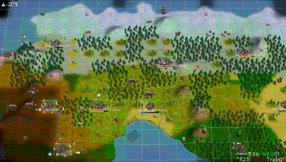
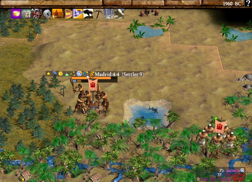
This screenshot is from a related build though I think it's slightly further along in development time. This was one of Sirian's screenshots and it contains one of his infamous dot maps, complete with a pink dot down in the south for reasons that have been lost to history. The main thing that I wanted to point out in this screenshot is the list of leaders that Sirian pasted onto the left side. There are several leaders here who never made the cut for inclusion into Civ4: Sargon (Sumeria) and Sundiata (Mali). The original design concept for Civ4 was going to have 20 civs with two leaders apiece for 40 total leaders before a bunch of them had to be cut for asset reasons; I have another page that will cover this topic in more detail. Also note that the colors for each civ are completely crazy in comparison to the finished game, a rainbow of bright shades that bears no relation to where they eventually ended up. Orange Saladin, blue Huayna Capac, and red Cyrus all look bizarre to those who have been playing Civ4 for the last two decades.
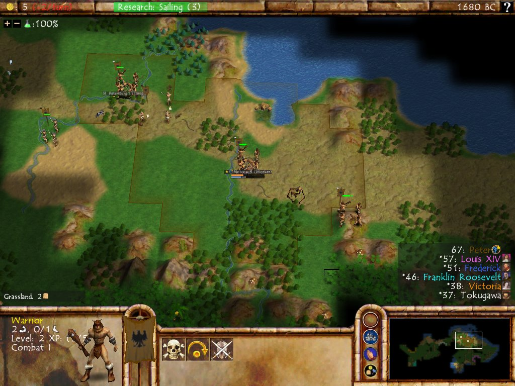
The name of this screenshot indicates that it was from Sirian's Single Player Group Test (SPGT) #6 which indicates that it likely dates from somewhere in late 2004 about a year prior to release. (The first SPGT that I took part in was #19 at the end of May 2005.) The gameplay has come a long way since the previous screenshots and is starting to look more like Civ4 now that most of the placeholder graphics from Civ3 have been removed. These builds were using what I think of as the "brown" interface, looking as if it were constructed out of wood or bricks. This was the same basic interface format that lasted down to the present though, with the sliders in the top-left, research in the top-center, a picture of the selected unit in the bottom-left, the main controls at the bottom-center, and then the minimap at the bottom-right with the scoreboard above it. Note that there were still tiny leader portraits next to the names in this build, a feature that would be later scrapped because they were too small to see any details while also eating up valuable space to clutter the interface.
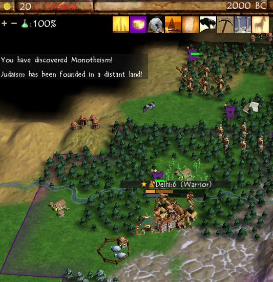
This image was taken from the very next group testing game, SPGT7. I saved this picture because it captured the tech icons that Civ4 was using at the time, many of which were placeholders pulled directly over from Civ3. If you're at all familiar with the Ancient era tech tree in Civ3, you'll be able to spot the icons for Polytheism, Monarchy, Horseback Riding, etc. The Civ4 techs that didn't exist in the previous game, like Hunting and Mining, are the ones with the roughest clip art since the developers knew that they were going to be replaced. I think that Sirian took this screenshot because he was highlighting that he discovered Monotheism only to have Judaism be founded in a distant land. This was quickly fixed: ever since, the player has always won any same-turn ties in Civ4 (by virtue of the face that the player is always in "Slot 1" and ties are resolved in slot order.)
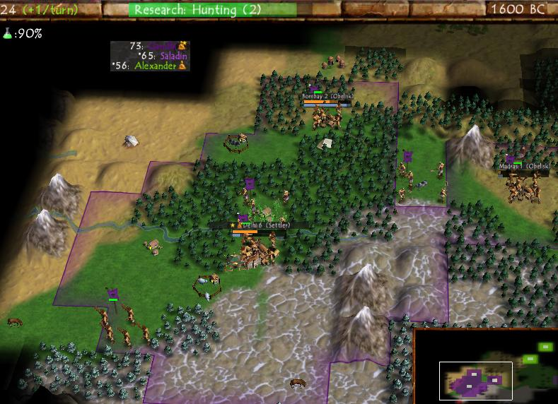
Here's a more zoomed out view from the same game. The early builds from this period have always given me the vibe of Warcraft 3, with the buildings and the terrain evoking a similar feel. This is probably due to the two games being developed at a similar time (Warcraft 3 came out in 2002 while these Civ4 builds date from 2004) and having a similar aesthetic. Civ4 would shift in a more serious direction during the final year of development in 2005 and the resemblence faded away by the time of release.
Enough of the overview map, how about a look inside one of the cities from this point in development? The city screen had the same basic format even at this early date, with the screen zooming into the 21 tile radius in the center along with completed buildings on the left, resources and specialists on the right, and then the build queue options at the bottom-center. One bizarre aspect of this city screen is that the city's culture bar appeared at the top of the interface next to the research bar, an unintuitive spot which would later move to the bottom-left corner. More amusingly, the early city screen was using the Civ3 advisors for the specialist graphics, with Sid Meier's Science Advisor face popping up here as the Scientist specialist. The bottom-center of the screen has the placeholder graphics for some of the Great People along with unfinished unit art for everything other than the worker, pikeman, and knight. I remember the testing builds that I played having a lot of brown squares for various units there, especially the unique units which were some of the final ones to get their art assets.
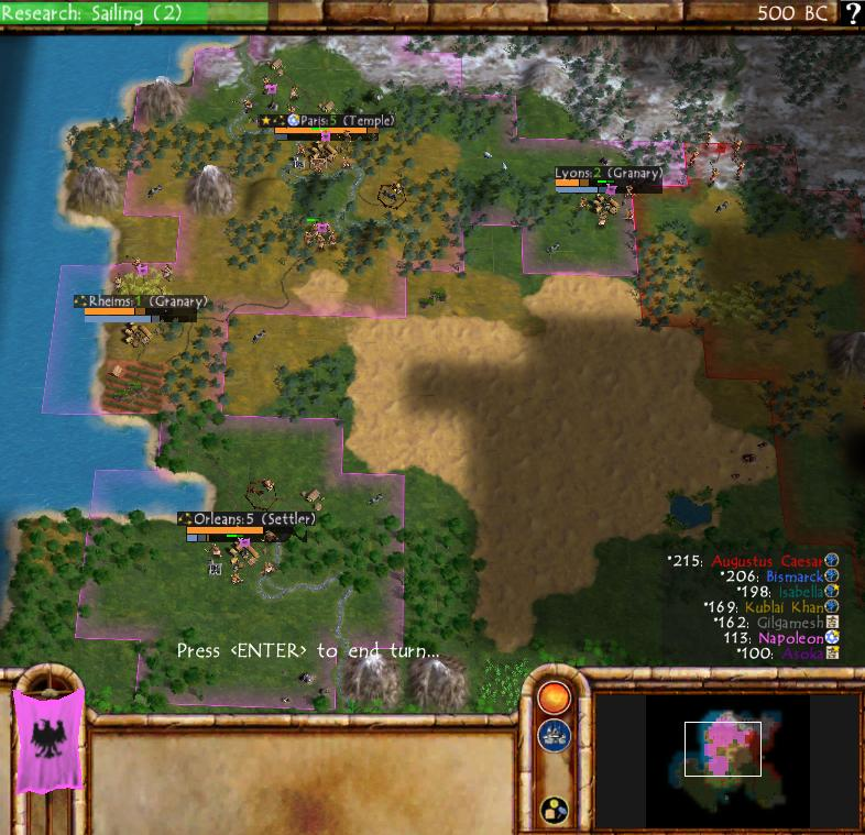
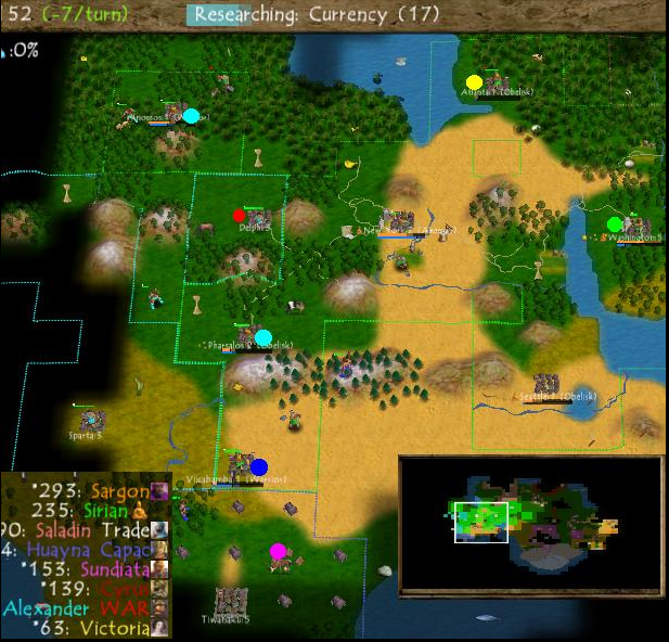
This screenshot from SPGT9 was interesting for having Augustus Caesar and Gilgamesh present, both of them leaders which would be cut from the release version of Civ4 and not appear again until the arrival of the expansions. I'll also point out the symbol being used for Hinduism in these earlier builds, which was based on some famous sculptures of the god Shiva but wasn't tied directly to the religion itself. This was caught by the testing group, one of whom suggested using a more accurate symbol for the religion and the replacement was made before the game released. Note as well that the units had colored flags attached to them by this point but everyone was using the same generic eagle symbol, which worked OK for some background colors and didn't fit at all for the bright pink of Napoleon's France.
EDIT: A comment on our local Discord from ABC170 about those pink borders made me realize where they were coming from: they were a leftover detail from Civ3! France infamously had pink borders in Civ3 due to some kind of residual anti-France feeling in the United States when the game was made in 2001. Now I can also recognize Germany's blue coloring from Civ3, Rome's red color, India's dark purple, and so on. It finally makes sense!
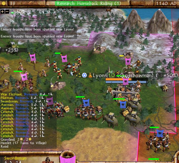
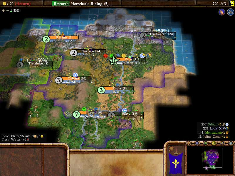
This image from the same game depicted a military clash between Napoleon and Bismarck. The biggest detail for me is the number of figures in each military unit: most of them had 5 individuals present instead of the 3 figures used by the release game. Similarly, there were 4 people in each worker unit and 3 elephants in the war elephant unit, instead of the 2 of each employed by the finished game. I wasn't part of the discussions that led to this change, however I believe that the rationale for decreasing the number of figures in each unit was that they looked too cluttered and the animations took too long to play out. Those extra individuals being there look weird after being used to the 3 people in the finished game for such a long time. Note also that catapults only had 4 strength in this build which likely made them too weak given when they appear on the tech tree.
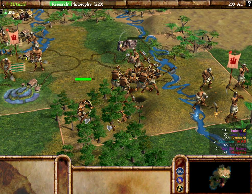
Those units are easy to see in this zoomed-in screenshot taken a few months later during SPGT13. This was an axe vs axe battle and it illustrates how chaotic these fights looked when there were more combatants chopping away at one another. Elsewhere, there were two significant changes to the interface that had taken place in the last few months. First of all, that ridiculous Comic Sans font was gone and replaced with a much more standard font option; it would change one more time before the release version but stayed pretty similar to what was depicted here. This included the leader names on the scoreboard where most of those other leaders that failed to make the cut had disappeared by now, with the exception of Gilgamesh. The other change of note was the adoption of national flags for the first time, with Isabella now having her familiar Castillian heraldry adorning the workers. This was a bit confusing at the time because the colors on the flags didn't match the leader colors on the scoreboard until getting fixed a little later.
Here's the city screen interface taken from the same SPGT13 game and updated from the previous city image above. The biggest shift here was the adoption of that new text font, as well as slightly shifting the camera angle while depicting the city's 21 tile radius to have more of a top-down viewpoint. The Great Person progress bar in the bottom-right corner also shifted to its familiar gold color, as opposed to the weird green color in the previous image, and a few more of the unit portraits had finished artwork by now. My favorite part is that the specialists were still using the Civ3 advisor images, especially Military Advisor Sid at the top. There were no Priest specialists in Civ3 so I'm not sure where that other placeholder artwork came from.
This is a quick look at some of the religious artwork from this same game, an early version of the infamous Three Headed Hydra with Spain on a Lake (TM) founding the first three faiths. Confucianism and Christianity both have their icons listed at the top of the screen along with their respective techs; Theology's tech icon was really funky and appears to be a miniature version of a stained glass window.
This next image comes from about a month later during the SPGT15 game which would have been played around March 2005. This was taken from an archipelago map and indicates that the water tiles were essentially done at this point though the various land terrain tiles would receive some more visual updates before release. Interestingly, the American leader was still being listed as "Franklin Roosevelt" at this point before being shortened to "Roosevelt", and Gilgamesh was still kicking around too. On that note:
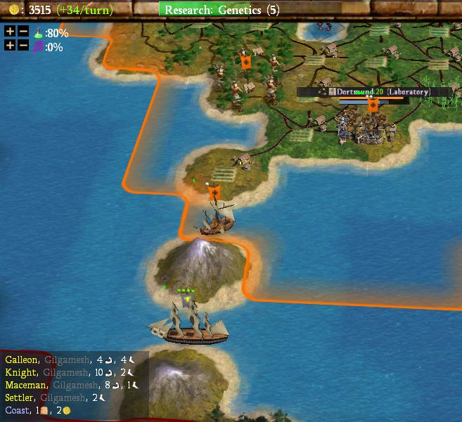
I saved this picture from that same SPGT15 game because it captured one of Gilgamesh's galleons at sea. This was just before Gilgamesh was cut from the release version of Civ4 (he was already gone when I gained access to the testing group) and I always thought of this as his farewell voyage, sailing off into the west in Lord of the Rings fashion and all that. The poor guy was a very late cut and almost made it into the release version before having to wait for the Beyond the Sword expansion. Note that Sumeria essentially kept the same national flag symbol all through that long delay, with a bull's head staring straight ahead just barely visible on that little ship.
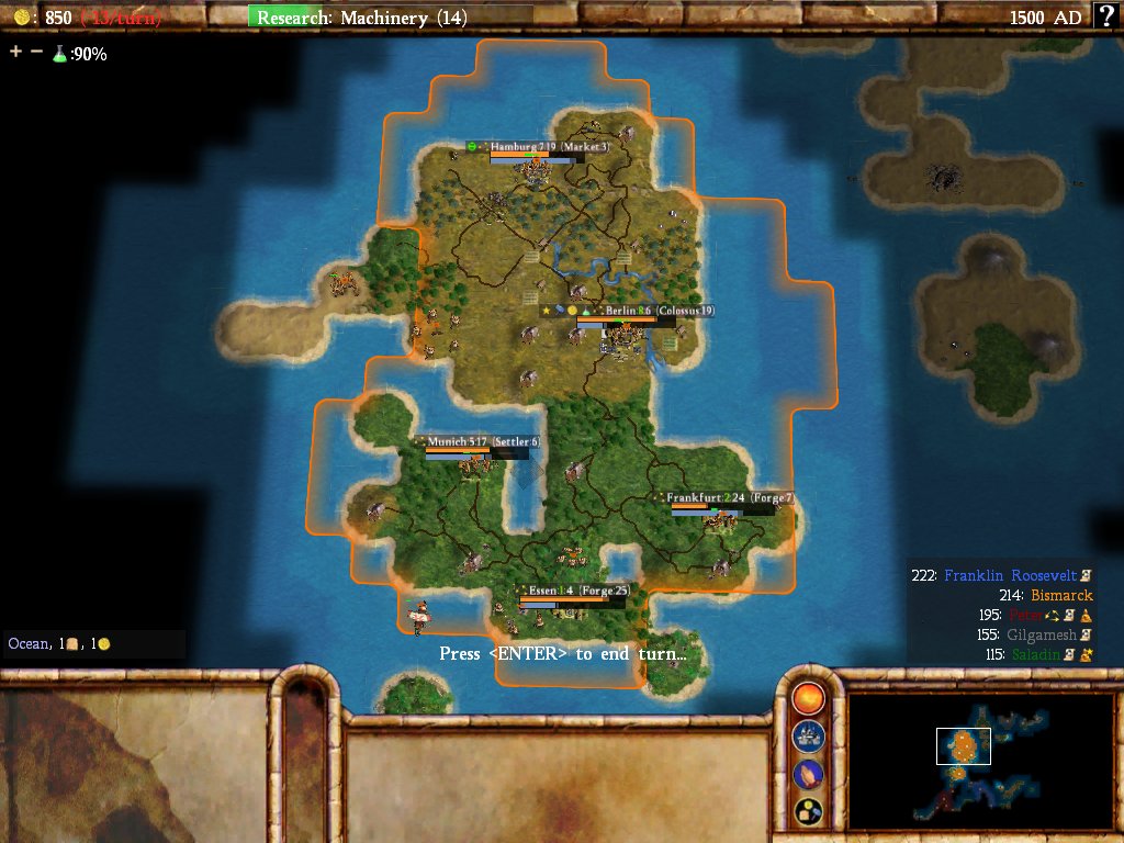
And this picture was taken from SPGT17 which was played in April 2005, a group game that took place while I was waiting for my testing CD to arrive and which coincided with my final Civ3 game in Epic 48. I was reading the Civ4 Frankenstein forums while writing the report for that last Civ3 game and it absolutely colored the report that I put together. Another major interface update had taken place that switched the city overview into the form that lasted to the present day. Cities now had their size on the left side, with much more visible growth and production bars next to it, and then any city icons located above the growth bar. The terrain graphics still look pretty rough here but this is much, much more recognizably Civ4 as compared with some of the earlier screenshots. And look, the leader colors on the scoreboard were also updated! Now they matched the national flag colors aside from Julius Caesar who had a peach color for some reason. This was what the test builds looked like when I first got my hands on Civ4 a few weeks later.
That takes us up to my first introduction to Civ4's gameplay; next we'll start covering my test reports themselves.


